Health Journaling App
A mobile app prototype designed to help cancer patients track symptoms during treatment
Project Description
The HealthComms mobile app prototype was designed to support cancer patients in tracking symptoms throughout treatment, based on the idea that detailed symptom tracking could improve patient care.
To achieve this, I began by defining the project scope and gathering insights through interviews with doctors, patients, and stakeholders, which helped shape a patient-centered journey map and information architecture.
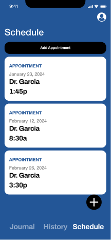
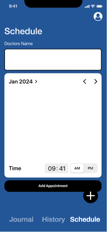
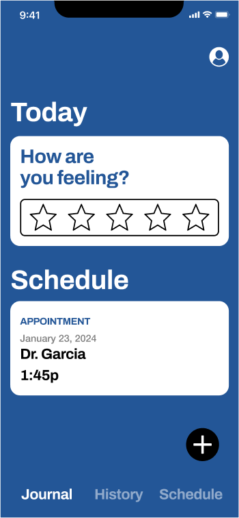
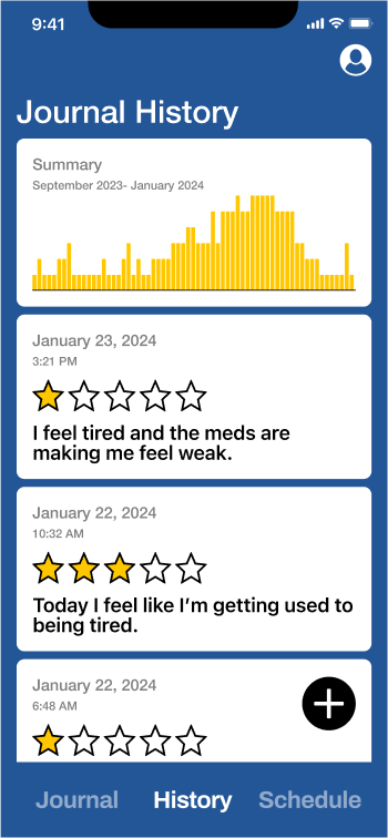
Using wireframes and high-fidelity mockups, I created a clear and intuitive interface to guide patients in documenting symptoms easily. The result was a prototype that enhanced communication, offering doctors accurate, timely insights to improve the quality of patient care.

User Research
Our research involved interviews with cancer patients, caregivers, and healthcare providers. Key findings revealed that patients often struggle to accurately recall and communicate their symptoms during medical appointments, leading to potential gaps in care.
We identified several key pain points in the current symptom tracking process, including difficulty in remembering symptoms between appointments, lack of standardized tracking methods, and limited communication channels with healthcare providers.
Information Architecture
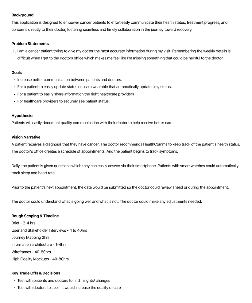
We diagramed a simple information architecture diagram to create a smooth, intuitive experience in the HealthComms app.
Organizing content logically helped patients quickly log symptoms and communicate with their care team, minimizing frustration and ensuring easy navigation.
This clear hierarchy made the app an effective, user-friendly tool that supported patients throughout their treatment journey.
Wireframe Mockups
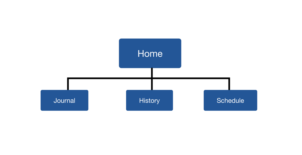
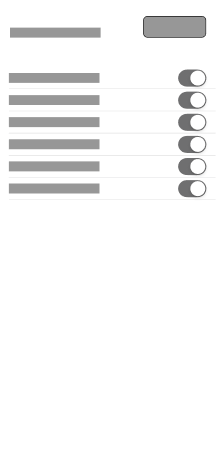
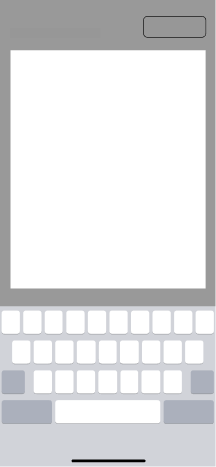
Initial wireframes focused on creating a simple, clear interface for daily symptom logging. We prioritized quick entry and easy navigation between different tracking categories.
The wireframes helped us validate the information architecture and user flows before moving to high-fidelity designs.




High-Fidelity Mockups
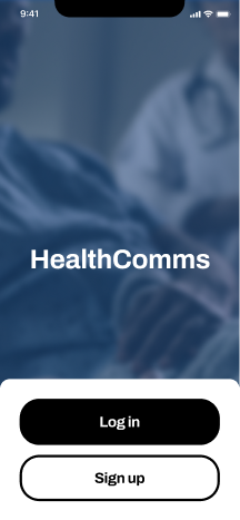
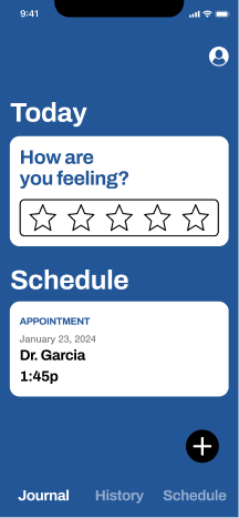
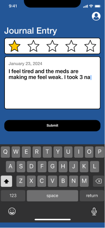
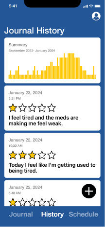
The final design incorporates a clean, medical-appropriate color scheme and clear typography hierarchy. We added micro-interactions to make the tracking experience more engaging while maintaining professionalism.
The high-fidelity mockups were refined through multiple iterations of user testing and feedback.
